Packaging&Merchandising design: Final Project Report[Nestle]
Introduction
This final project is to design a chosen food packaging for Nestle food product
and need to localize the flavor. I have chosen to create a new product for
Nestle.
The new brand name is MELT IT.
Besides the packaging of product, a standee that can be display on the checkout
counter is a compulsory, wherever this product going to be sold.
MELT IT is a product that to make coffee more tasty and unique.
About MELT IT
MELT IT is a new Halal product, which is similar to Nestle Coffee-Mate. It is like
a chocolate bar that can melt in the hot coffee to make it more delicious in a
affordable price.
A box of MELT IT contains 15 bars. Each bar served for a cup of coffee. It came
with 3 flavors, which are chocolate, coconut and pandan. Chocolate mixed with
coffee is a very common combination. Coconut and pandan represented the local
flavors of Malaysia. Coconut mixed with coffee is very refreshing and pandan
mixed with coffee will make coffee more fragrant
and rich.
Concept
Below are my standee and packaging inspiration.
Functionality
Materials of packaging: Art card with matt lamination and PVC
The main material of packaging is art card and minor is PVC. The packaging is a
rectangle shape box. Tear the dashed
line to open the box and it will looks like a small standee.
The PVC part is at the back of the box, its let consumer can see the products
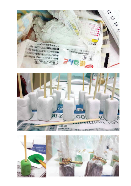
inside the box. (I used paper clay to make the product mock up and then coloured it.)
Materials of
standee: Gator board and model board
The standee is
build up with gator board and the base is made up model board and gator board
together to make it more stable.
Color and Pattern
Coconut, pandan leaves and cocoa in a stamping look represented the 3 flavors
of MELT IT mixed into the coffee.
Main color on the
packaging is brown. Used of brown to bring out the natural feeling to consumer.
All the graphics and texts color were in black to make it simple.
The template and design of my packaging.
The logo design and the 3 flavours stamp.
Target Market
Target market of MELT IT is adults and young
adults from age 18-35 who enjoy coffee. With MELT IT, no matter students or
office employees can enjoy the “high-tea” session at home and office in a very
easy way. It will make them feel they’re
having coffee in a nice café shop.
The Packaging and Standee
Front, Left, Right, Back and Top sides view of the packaging.(Click to enlarge it.)
Tear the dashed line to make the packaging became a little standee.
Front and Side views of the standee together with the packaging.


